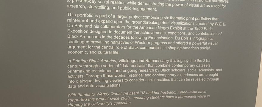
Last week, I had the opportunity to visit the Printing Black America Exhibit in the Samek Art Museum in the ELC.
The exhibit contains five pieces of a larger collection that were created by William Villalongo and Shaddha Ramani. These pieces were inspired by WEB DuBois’ data portraits created for the 1900 Paris Exposition to identify the history of African Americans in the United States and the state of the African American community in the 20th century.
Thanks to the Trevisani Student Advised Art Acquisition Project, these prints are permanently housed in the Samek Art Museum’s collection.
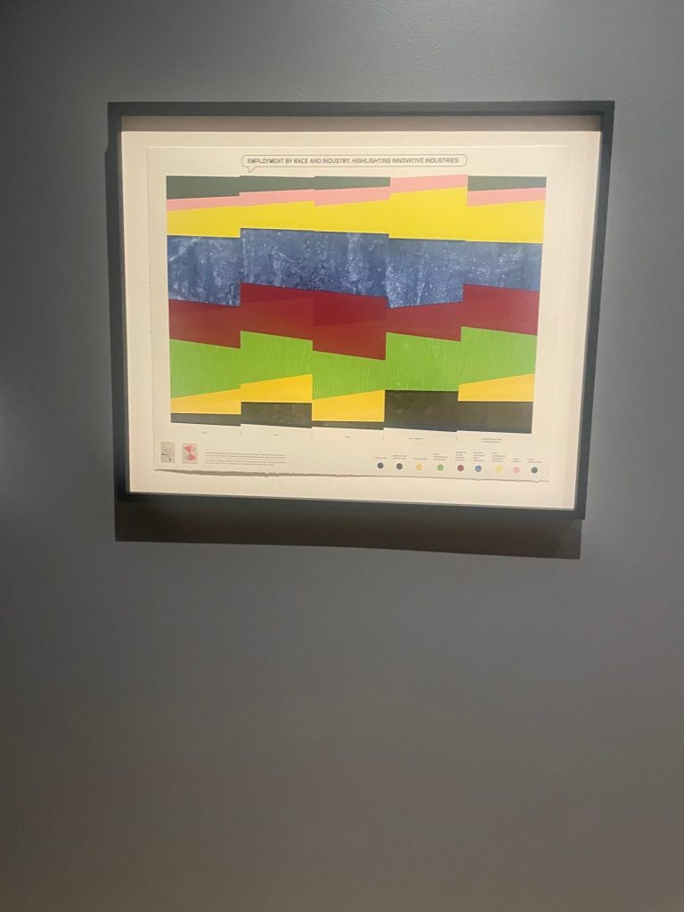
What I appreciate most about these prints is how they reimagine what traditional representations of data look like.
In the corner of each print, there is a small picture of the data visualization created by DuBois that inspired the piece. In the corner of this print is a bar graph and instead of just creating a traditional bar graph, the artists recreated the bar graph as a circle.
This print (below) represents Black homeownership in the US and shows the highest rates of Black homeownership in states such as Alabama, South Carolina, Mississippi, and Maryland.
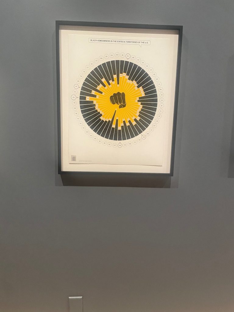
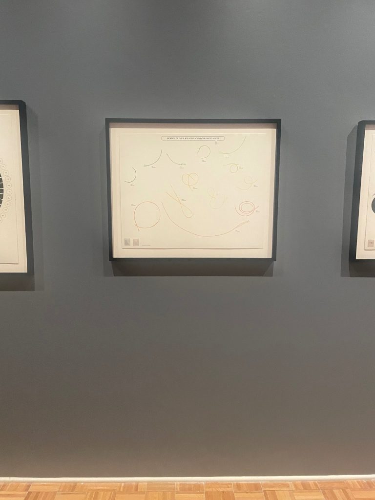
These prints not only reimagine DuBois’ data visualizations but they also force modern audiences to examine the messaging behind these portraits and interpret the meaning behind the images used.
In this print, the artists represent DuBois’ bar graph on the increase in the black population as what appears to be pieces of string or different shapes that change color and size towards the right similar to how the composition and size of the black community has evolved over time.
This last piece was my favorite and it is one of two prints from this collection titled Black Migration to the US. This print represents current black migration with black arrows and forced black migration through the trans-Atlantic slave trade with red arrows from DuBois’ original data visualization.
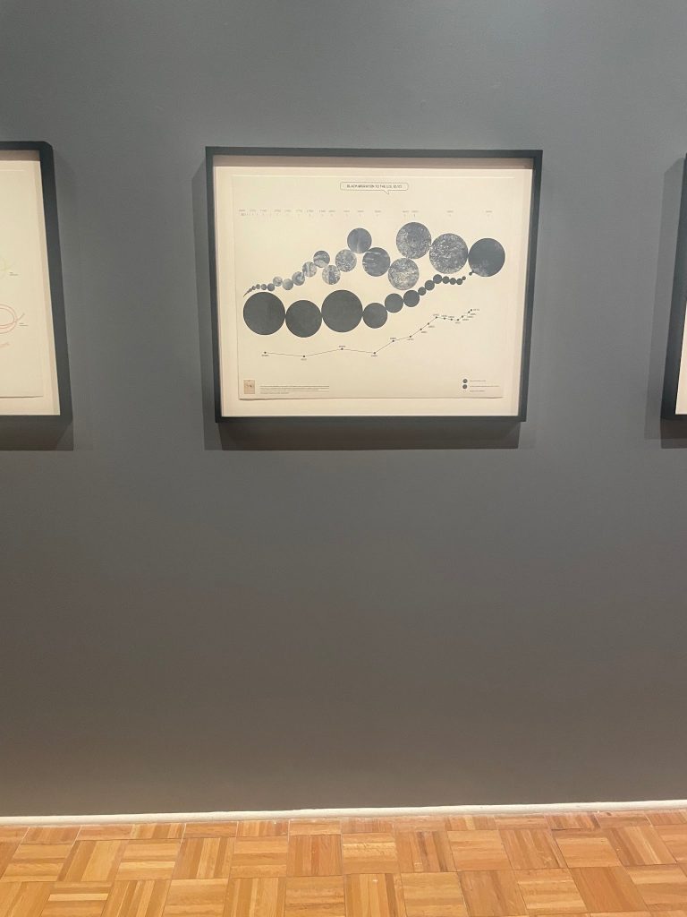
When I first saw this print, I was confused about the oddly shaped map and position of the continents. I later learned that the artists used the Fuller Map Projection which provides a more accurate representation of the sizing of landmasses. The flat state of the map was suggested by the artist to show interconnectedness between continents (“PBA – Black Migration to the US — William Villalongo”). This print’s reinterpretation of DuBois’ work is powerful because it sends a message of unity. The depiction of Africa in this portrait was particularly striking due to the size in the portrait compared to traditional maps of the world.
Overall, I would recommend everyone to see the prints in this exhibit!
-Rachel Adetutu